Editorial map illustration for Orlando Magazine, July 2026 issue
Art Direction: Milena Garces
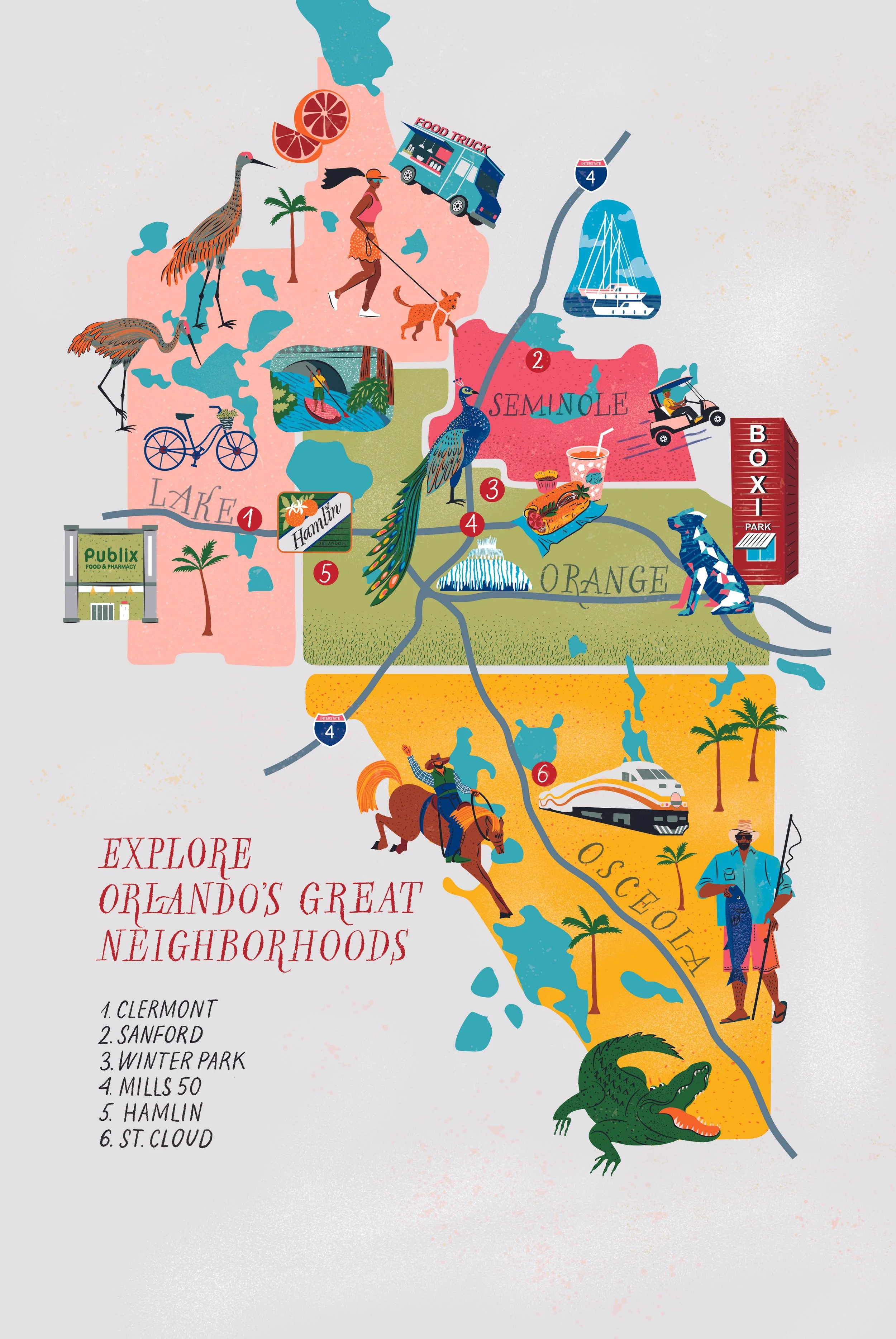
This illustrated map was created for Orlando Magazine’s annual Great Neighborhoods feature, highlighting six communities across the Greater Orlando area: Clermont, Sanford, Winter Park, Mills 50, Hamlin, and St. Cloud.
Each neighborhood is represented through its distinctive landmarks, architecture, wildlife, food, and elements of everyday life—from Clermont’s citrus groves and Sanford’s RiverWalk to the peacocks of Winter Park and the lakes and alligators of St. Cloud. Organic county shapes, custom hand lettering, and a bright, Florida-inspired color palette bring the locations together in a playful composition while preserving the geographic relationships between them.
Designed as a full editorial spread, the map combines visual storytelling with a clear sense of place, inviting readers to discover the unique character of Orlando’s surrounding communities.
Client: Orlando Magazine
Services: Editorial Illustration, Illustrated Map, Hand Lettering
Read the article here https://www.orlandomagazine.com/orlandos-2026-great-neighborhoods-remix-edition/
Boston Neighborhood Maps for Herein Magazine
Editorial map illustration series for Herein Magazine
Art Direction: Alice Morgan
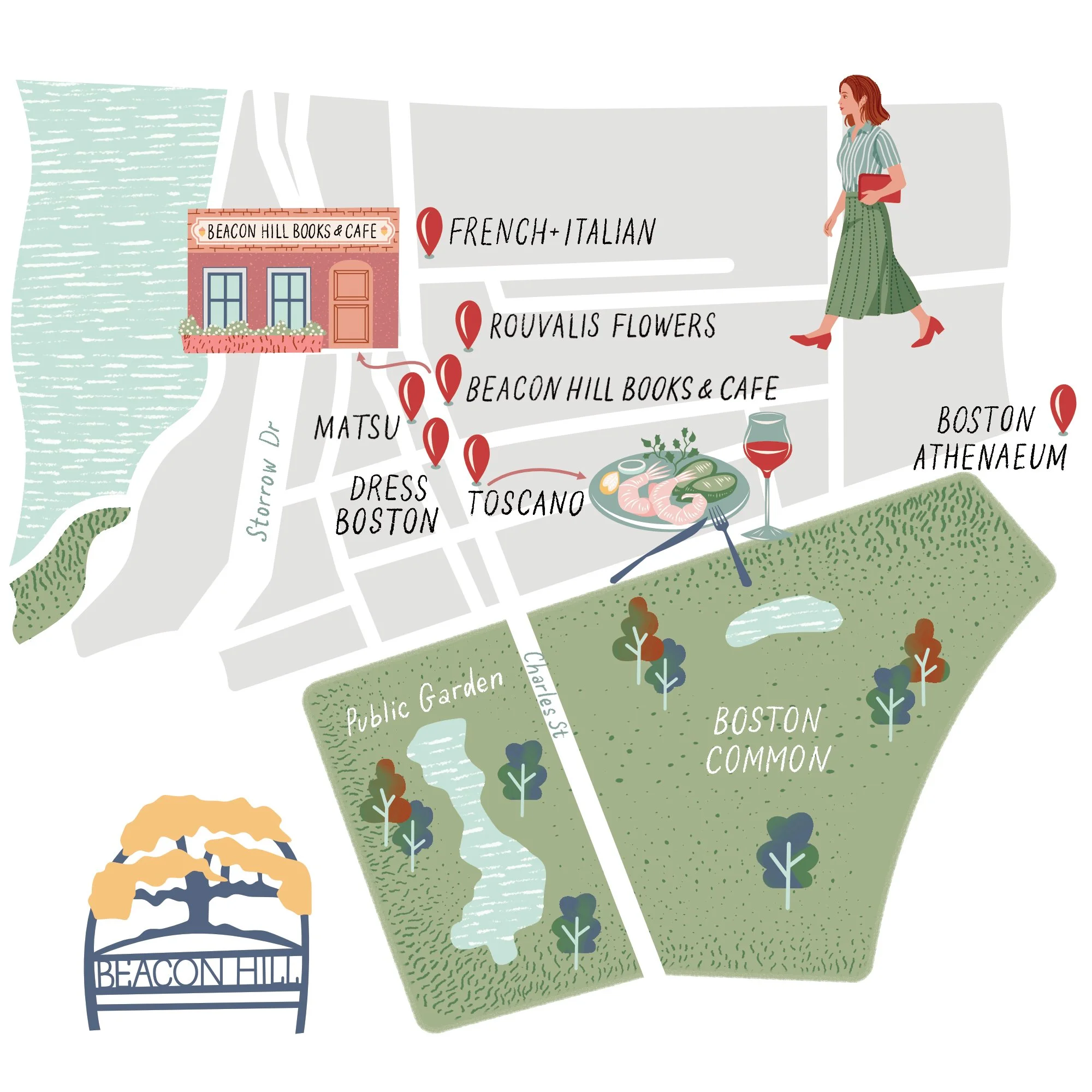
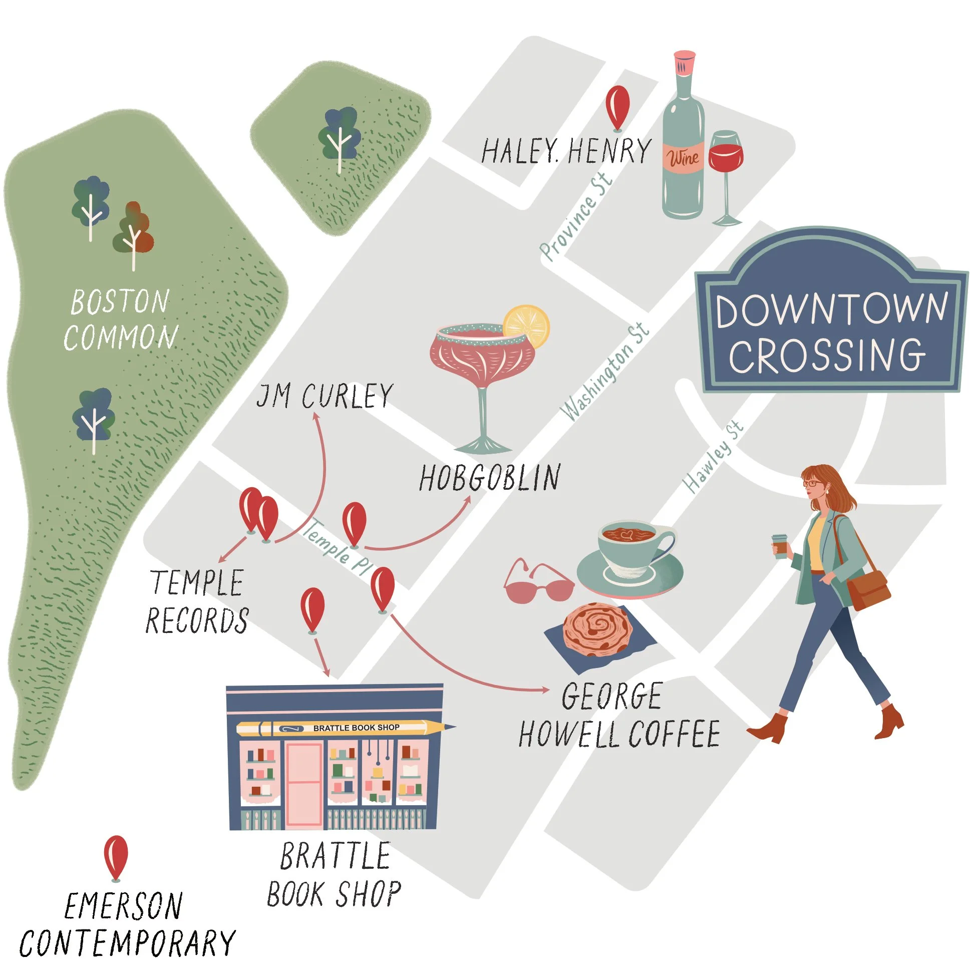
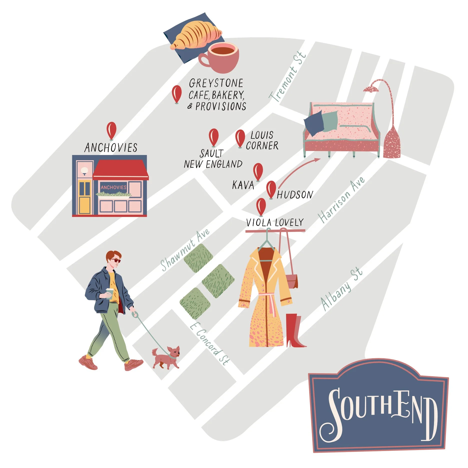
Created for Herein Magazine, this series of illustrated neighborhood maps was developed for a feature exploring different areas of Boston through local landmarks, restaurants, and cultural destinations. The project included three custom editorial maps designed to accompany written articles and help readers navigate the city in a visually engaging way.
Working under the art direction of Alice Morgan, I created a cohesive visual system that combines hand-lettered typography, simplified cartography, and custom illustrated icons. Each map balances editorial readability with atmosphere, aiming to feel informative while still capturing the personality of each neighborhood.
The illustrations were intentionally kept clean and approachable to work at a relatively small print size while remaining visually rich. I developed custom landmarks, architectural elements, small character illustrations, and location markers tailored to each area, using a muted color palette that fit the magazine’s overall design direction.
The people featured within the maps are illustrated versions of the article authors themselves, visually integrated into the neighborhoods they wrote about. This detail helped connect the editorial storytelling with the maps more personally, giving each spread an additional narrative layer.
The goal of the project was not only to help readers orient themselves geographically, but also to create a sense of discovery and visual storytelling throughout the spreads.
Boston Neighborhood Maps for Herein Magazine
Editorial map illustration series for Herein Magazine
Art Direction: Alice Morgan
Created for Herein Magazine, this series of illustrated neighborhood maps was developed for a feature exploring different areas of Boston through local landmarks, restaurants, and cultural destinations. The project included three custom editorial maps designed to accompany written articles and help readers navigate the city in a visually engaging way.
Working under the art direction of Alice Morgan, I created a cohesive visual system that combines hand-lettered typography, simplified cartography, and custom illustrated icons. Each map balances editorial readability with atmosphere, aiming to feel informative while still capturing the personality of each neighborhood.
The illustrations were intentionally kept clean and approachable to work at a relatively small print size while remaining visually rich. I developed custom landmarks, architectural elements, small character illustrations, and location markers tailored to each area, using a muted color palette that fit the magazine’s overall design direction.
The people featured within the maps are illustrated versions of the article authors themselves, visually integrated into the neighborhoods they wrote about. This detail helped connect the editorial storytelling with the maps more personally, giving each spread an additional narrative layer.
The goal of the project was not only to help readers orient themselves geographically, but also to create a sense of discovery and visual storytelling throughout the spreads.
Boston Neighborhood Maps for Herein Magazine
Editorial map illustration series for Herein Magazine
Art Direction: Alice Morgan
Created for Herein Magazine, this series of illustrated neighborhood maps was developed for a feature exploring different areas of Boston through local landmarks, restaurants, and cultural destinations. The project included three custom editorial maps designed to accompany written articles and help readers navigate the city in a visually engaging way.
Working under the art direction of Alice Morgan, I created a cohesive visual system that combines hand-lettered typography, simplified cartography, and custom illustrated icons. Each map balances editorial readability with atmosphere, aiming to feel informative while still capturing the personality of each neighborhood.
The illustrations were intentionally kept clean and approachable to work at a relatively small print size while remaining visually rich. I developed custom landmarks, architectural elements, small character illustrations, and location markers tailored to each area, using a muted color palette that fit the magazine’s overall design direction.
The people featured within the maps are illustrated versions of the article authors themselves, visually integrated into the neighborhoods they wrote about. This detail helped connect the editorial storytelling with the maps more personally, giving each spread an additional narrative layer.
The goal of the project was not only to help readers orient themselves geographically, but also to create a sense of discovery and visual storytelling throughout the spreads.
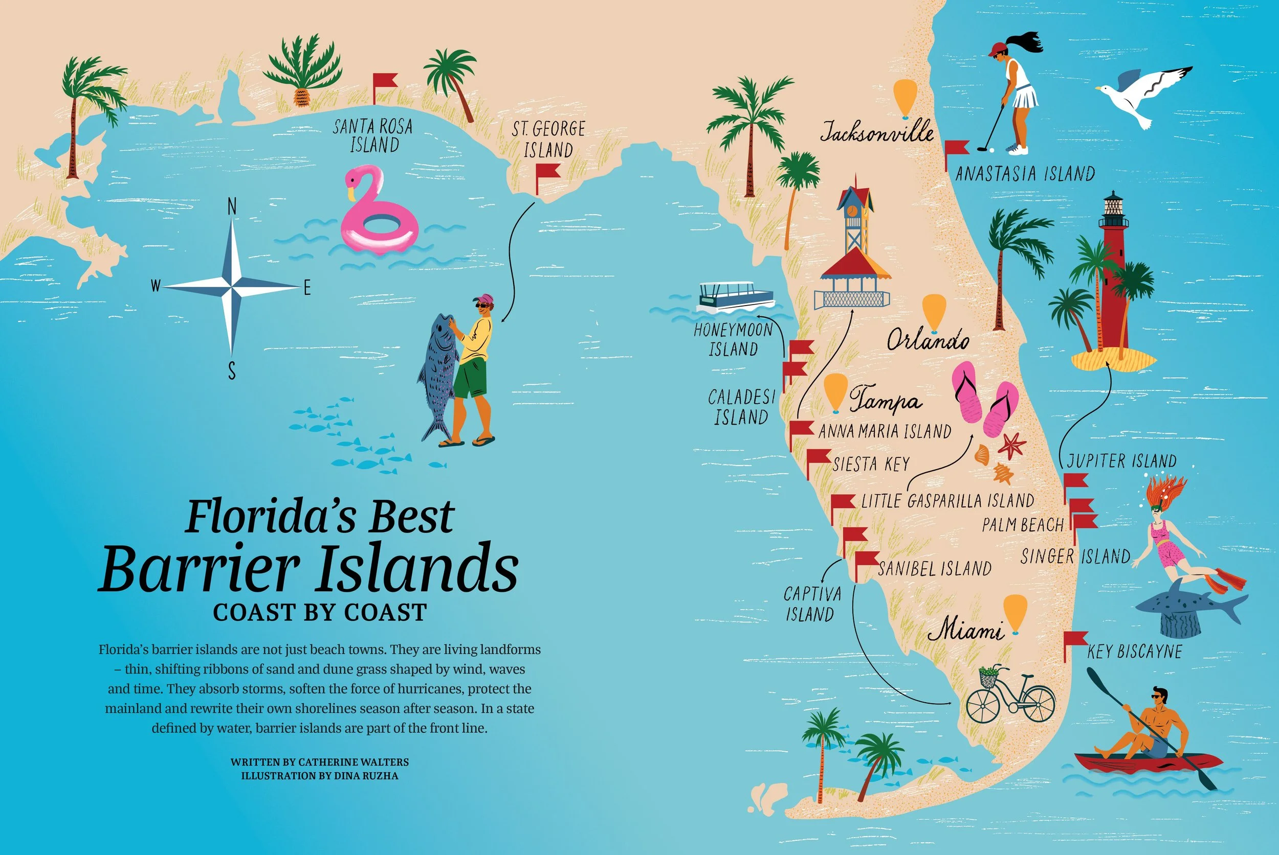
Florida’s Best Barrier Islands
Editorial map illustration for Orlando Magazine
Art Direction: Milena Wambold
Created for Orlando Magazine, this illustrated map was designed for the feature “Florida’s Best Barrier Islands, Coast by Coast.” Under the art direction of Milena Wambold, I developed a stylized map of Florida that combines editorial clarity with a playful, destination-driven visual language.
The piece brings together hand-lettered place names, custom icons, and small narrative details to guide the reader through the article while giving each location its own distinct character. The aim was to create an image that feels both informative and atmospheric — a map that supports the story, enhances navigation across the spread, and adds a strong sense of place.
Read the article here https://www.orlandomagazine.com/13-best-barrier-islands-in-florida-you-need-to-visit/
Illustrated Map for The Seaport
Client: Seaport Entertainment Group
A playful, adventure-filled illustrated map created to showcase the vibrant atmosphere of The Seaport — from hidden gems to must-see landmarks.
Commissioned as part of a travel influencer summit, the map became a visual centerpiece of the event and a key asset in The Seaport’s year-round branding across print and promotional materials.
Dina Ruzha uses her map skills to create an illustration for the front cover of Dallas Observer Magazine.
The illustrated map showcases Dallas' best places to eat - the Hidden Gems.
Using a vibrant colour palette for an attention-grabbing front cover, accentuated by bold, black-lined gem icons to showcase the diverse cuisine, Dina's piece spotlights Dallas' best-kept culinary secrets – those charming hole-in-the-wall joints offering delectable ethnic foods.
Macro & Micro London Maps
Client: Socrates Communications
Art Direction: Nyah Auld
I created two illustrated maps of London for The M Building — a macro map of the wider area and a micro map focused on the building’s immediate surroundings.
The client provided a list of key locations to include, from hotels and restaurants to shops and cultural landmarks. I mapped each point, gathered visual reference, and illustrated the buildings, people, and local details to create a system that feels both useful and full of atmosphere.
I hand-lettered all street and place names to preserve the organic feel of the artwork. Most buildings are shown in elevation, while The M Building is drawn in 3D to create a clear focal point.
The final maps were designed for web use and large-format print.
I’ve shared the creative process behind the illustrated London City Maps on Behance
https://www.behance.net/gallery/208947601/Illustrated-London-City-Maps
Macro & Micro London Maps
Client: Socrates Communications
Art Direction: Nyah Auld
I created two illustrated maps of London for The M Building — a macro map of the wider area and a micro map focused on the building’s immediate surroundings.
The client provided a list of key locations to include, from hotels and restaurants to shops and cultural landmarks. I mapped each point, gathered visual reference, and illustrated the buildings, people, and local details to create a system that feels both useful and full of atmosphere.
I hand-lettered all street and place names to preserve the organic feel of the artwork. Most buildings are shown in elevation, while The M Building is drawn in 3D to create a clear focal point.
The final maps were designed for web use and large-format print.
I’ve shared the creative process behind the illustrated London City Maps on Behance
https://www.behance.net/gallery/208947601/Illustrated-London-City-Maps
Editorial illustration illustrated map of London.
I was tasked with creating illustrated Elizabeth line map for the cool new community living project @andsoulcommunity in West London.
This project was executed under the creative direction of Jasmine Fisher, known as @jasminefisherltd. The illustration would be shown on the company's website.
Good Housekeeping Magazine commission Dina Ruzha for a set of illustrations remembering 9/11.
The article is a first-person narrative from a teacher who worked in Lower Manhattan during the September 11th terrorist attacks in New York. And on the 20th anniversary, the magazine shares her story about how she navigated the unprecedented attack and led her kids to safety.
Dina's expressive artworks include an illustrated map of Lower Manhattan highlighting the route that the teacher and students walked, a memorial plaque with text honouring the school, and a portrait of the teacher.
An illustrated map of St. Petersburg, Russia, highlights some of the best places in the historical center of the city.
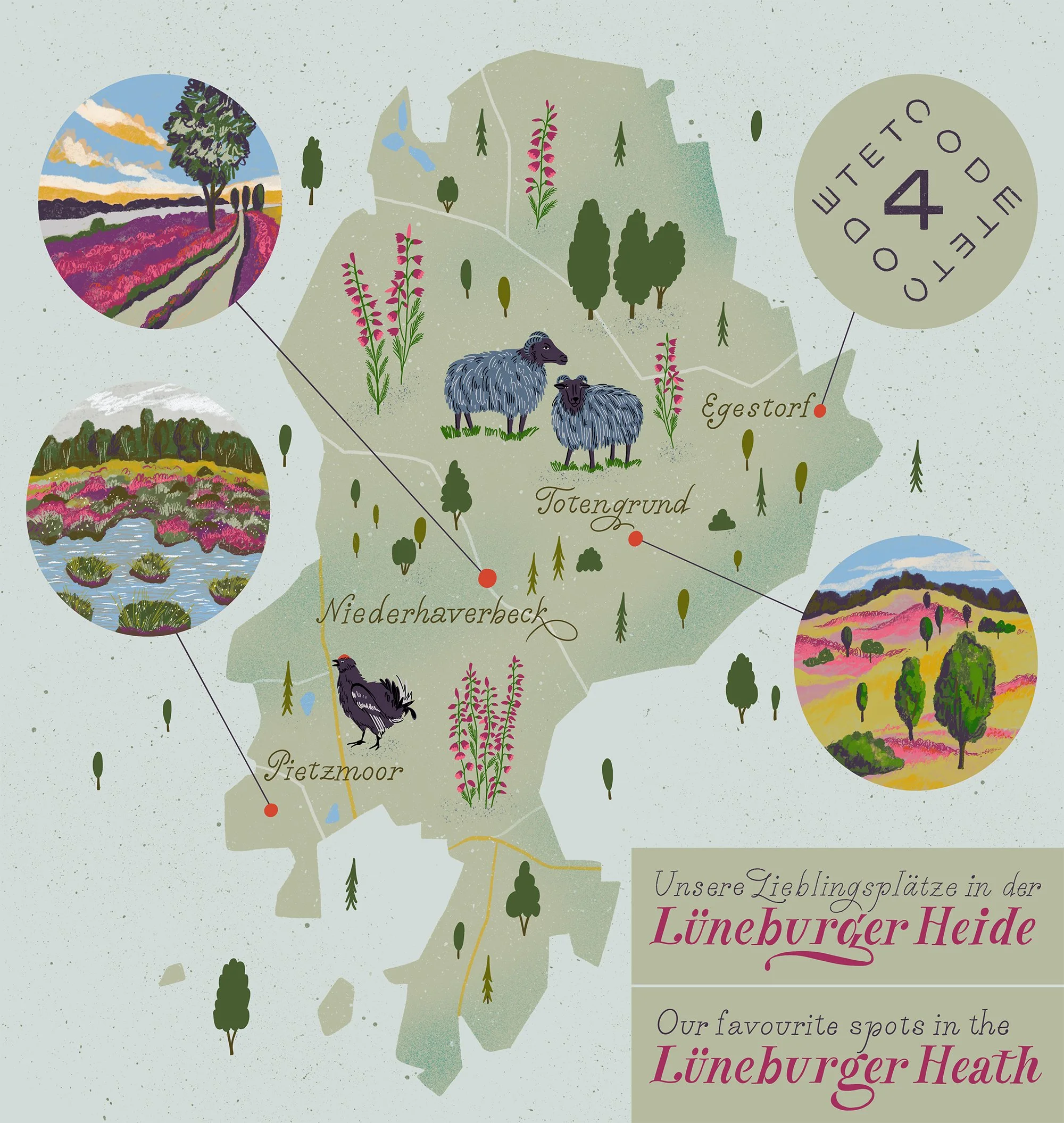
Lüneburger Heath Map Illustration
Client: Prof. Steinkraus Research Laboratories
I created this illustrated map of the Lüneburger Heath for Prof. Steinkraus Research Laboratories for a printed thank-you tabloid marking the first anniversary of the brand’s skincare launch.
The brief focused on four locations — Egestorf, Totengrund, Niederhaverbeck, and Pietzmoor — each translated into distinctive landscape motifs. I combined a clear map structure with scenic vignettes, emphasizing the valley character of Totengrund, the blooming heather of Niederhaverbeck, and the water-rich landscape of Pietzmoor. The final composition also includes local wildlife, with a sheep and a grouse integrated into the map.
For the same publication, I also created a portrait of the team.
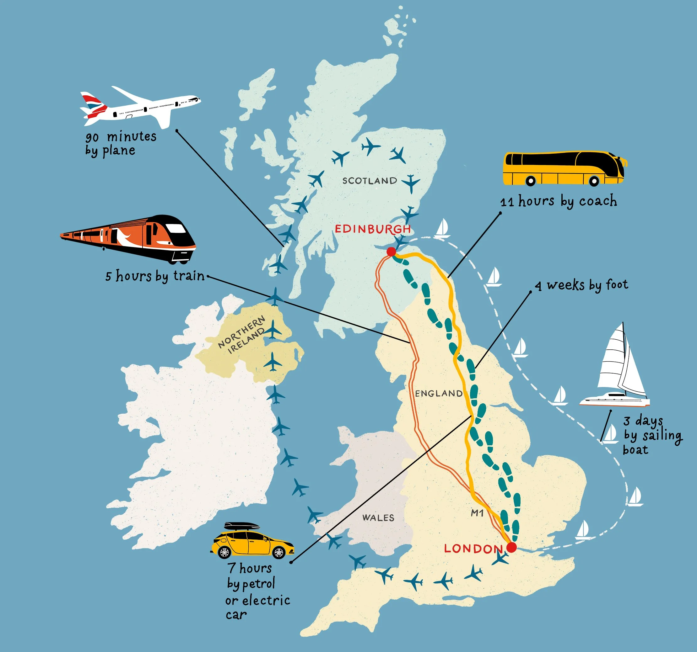
UK Transport Map Illustration
Client: Pearson Education
I created this illustrated map of the UK for Pearson Education for an educational publication aimed at teenage students. The brief was to show different routes between London and Edinburgh using a range of transport modes, including train, plane, coach, car, sailing boat, and walking.
The illustration combines a simplified map of the UK with custom transport icons and clearly marked routes, designed to make the information easy to follow while keeping the visual tone engaging and age-appropriate. The goal was to balance clarity, function, and personality within an educational format.
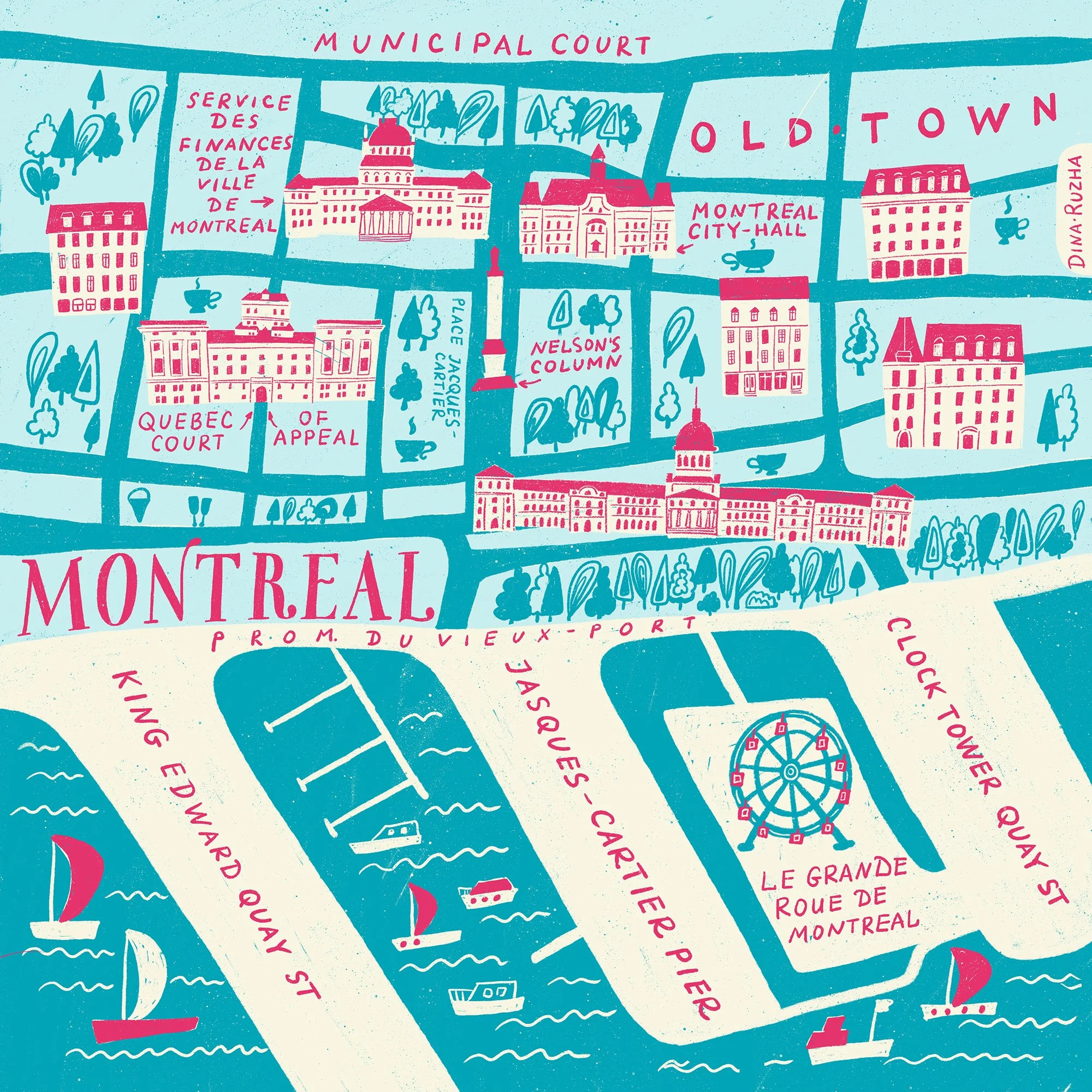
Montreal Map Illustration
I created this illustrated map of Montreal after traveling through Canada and falling in love with the city’s atmosphere. I was especially drawn to the contrast between the historic architecture, the waterfront, and the small visual details that made the area feel so lively and memorable.
This piece focuses on Old Montreal and the harbor, combining landmarks, boats, streets, and hand-lettered place names into a map that feels both observational and expressive. It became a way for me to translate the experience of the city into a playful, place-based illustration.
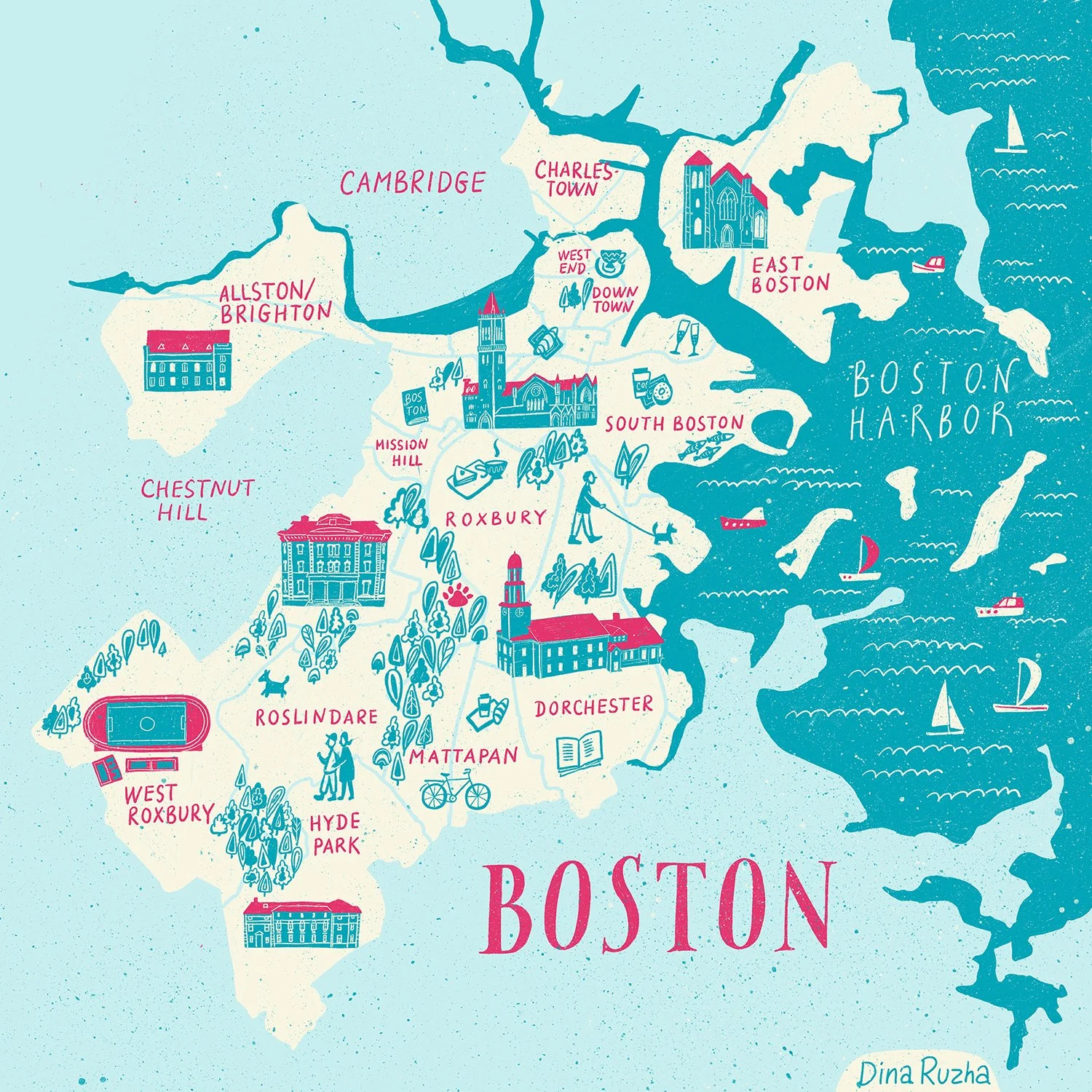
Boston Illustrated Map
Personal project
I created this illustrated map after a trip to Boston, wanting to hold on to the feeling of the city a little longer.
What stayed with me was the character of its neighborhoods — the architecture, the parks, the harbor, and the small details that make a place memorable. I wanted the piece to feel less like a diagram and more like a visual memory of being there.
Through hand-drawn lettering, local landmarks, and small everyday scenes, I tried to capture Boston as I experienced it: lively, layered, and full of character.