Book Cover Illustration & Lettering
Client: Ten Speed Press / Penguin Random House
Art Direction: Francesca Truman
Author: Jenna Moreci
About the project
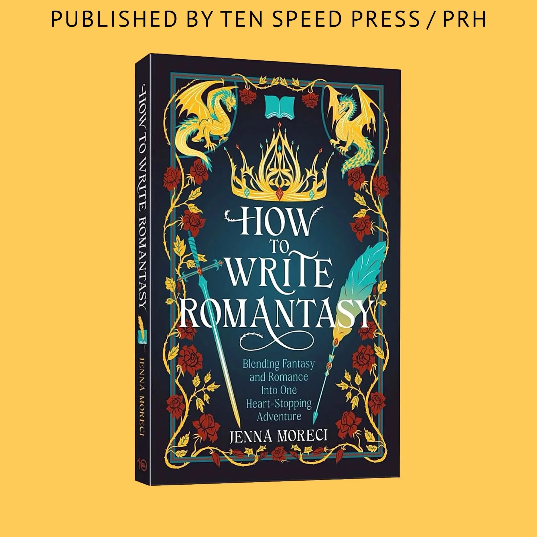
Cover design and illustration for How to Write Romantasy — a witty and inspiring guide that teaches writers how to blend fantasy and romance into one heart-stopping story. Written by Jenna Moreci, bestselling author and YouTube creator with an audience of over 280K subscribers, this book breaks down the craft of building compelling characters, powerful chemistry, and a truly “shippable” love story.
Design concept
The goal was to capture the duality of fantasy and romance — epic adventure meets emotional depth — while keeping the visual tone bold, modern, and marketable to Jenna’s established fan base. The design integrates symbolic elements of magic and passion, using rich color contrasts, elegant typography, and a sense of movement that echoes the dynamic storytelling inside.
I created the full cover design, including custom typography and lettering, to bring the title’s energy and personality to life.
Order the book here
Seeing Jenna Moreci’s unboxing video was truly heartwarming — it’s always a special moment to watch the cover come to life and feel the author’s excitement.
Book Cover Illustration & Lettering
Client: Head of Zeus (Bloomsbury)
Art Direction: Jessie Price
Author: Katrina Kendrick
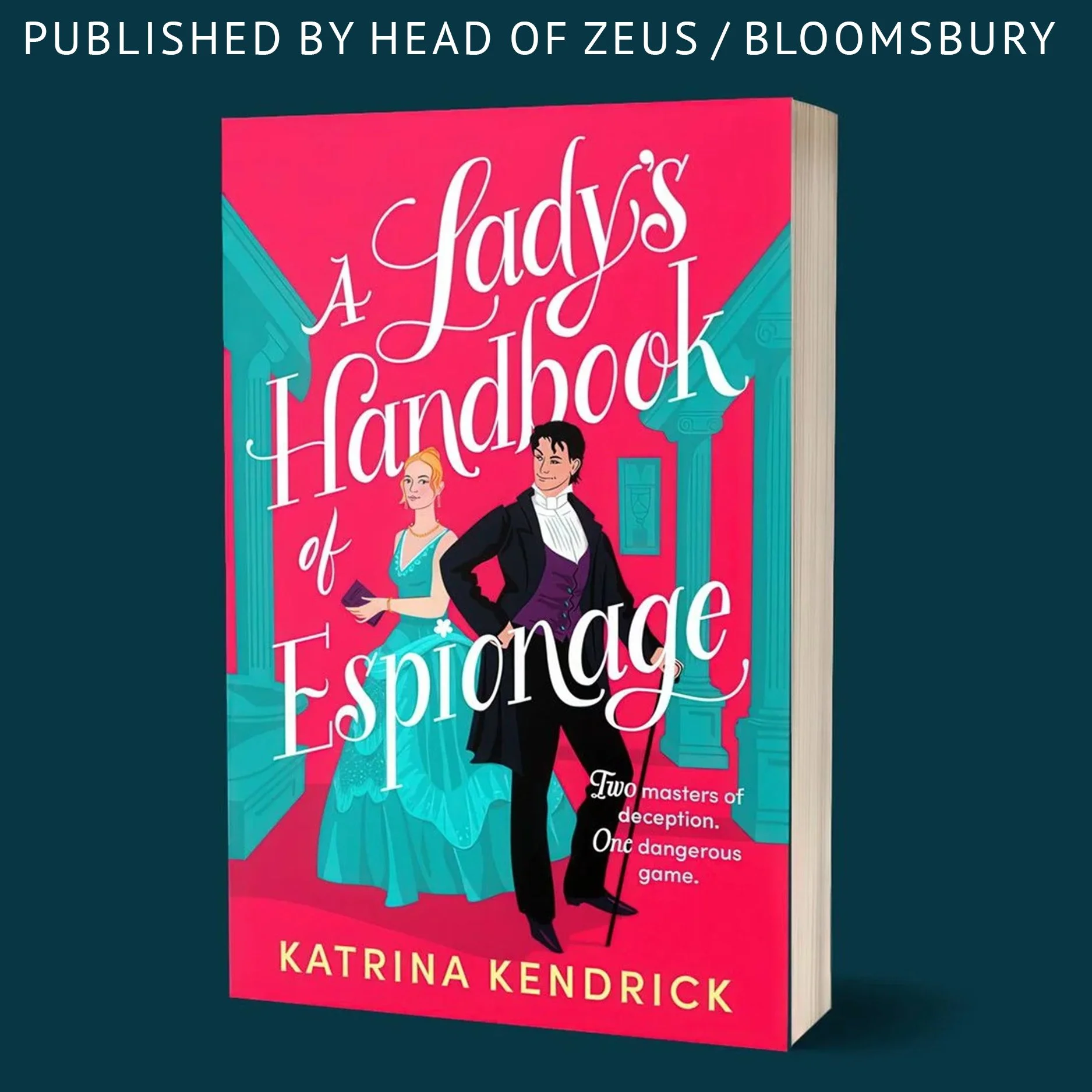
A Lady’s Handbook of Espionage is a steamy historical romance set in 1869 New York, where a Crown spy and an underworld mastermind form an uneasy alliance. I illustrated the cover with a strong sense of period drama, drawing visual inspiration from The Gilded Age and Bridgerton.
The emotional connection between the characters and the title lettering was central to the composition. I aimed for a high-contrast, digitally striking cover that would stand out on online storefronts. The hand-drawn typography was created specifically for this project to reflect the story’s mix of elegance, intrigue, and romantic tension.
Publication Date: November 2025
View on Bloomsbury
Photo Credit: Katrina Kendrick
Book Cover Illustration & Lettering
Client: HarperCollins (UK)
Art Direction: Ellie Game
Author: Felicity Cloake
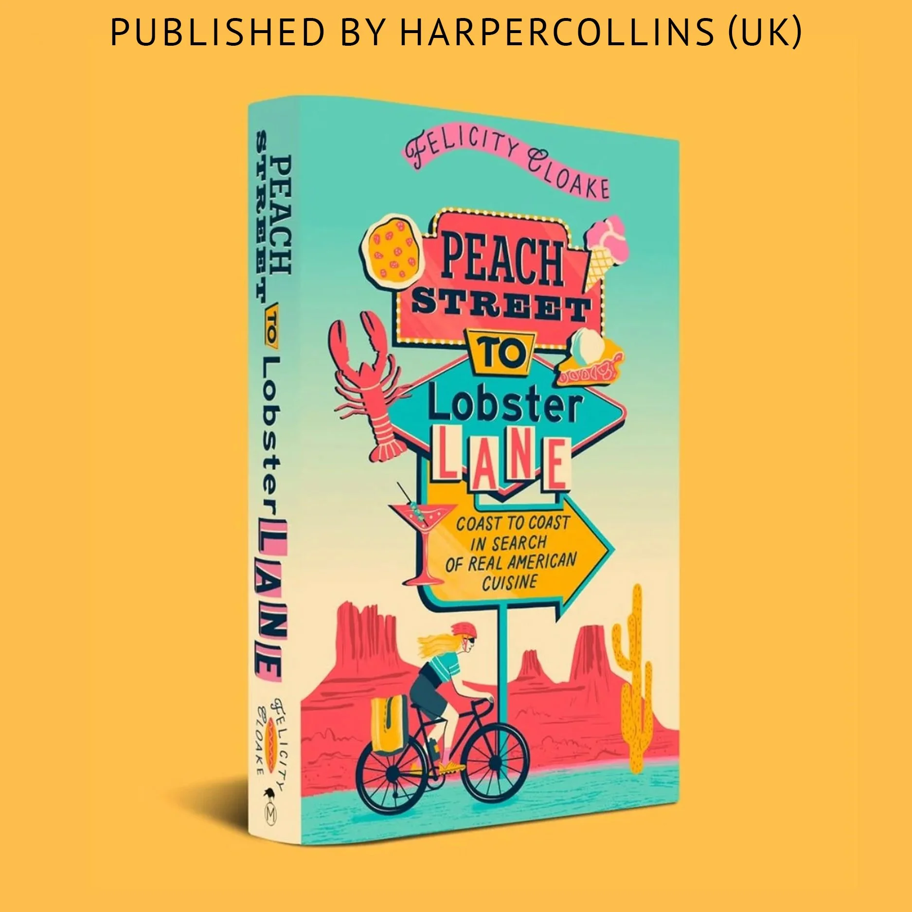
This cover was created for Peach Street to Lobster Lane, a vibrant travelogue by Felicity Cloake that follows her coast-to-coast bike journey through the U.S. in search of iconic American cuisine.
I was invited to bring this story to life through a bold wraparound jacket that blends expressive character design, custom typography, and playful food symbolism. Under the art direction of Ellie Game, we developed a retro-inspired road sign for the title, placing the author mid-ride against a backdrop of iconic American landscapes—from California redwoods and desert diners to the New York City skyline.
In addition to the jacket, I illustrated a detailed endpaper map charting Felicity’s real travel route, pairing regional foods with a sense of movement and discovery.
This project was a celebration of food, color, and character—a chance to merge storytelling with stylized design and typographic craft.
Published by HarperCollins UK
harpercollins.co.uk/products/peach-street-to-lobster-lane
Photo credit:
Instagram @itselliegame (Ellie Game, Art Director)
Instagram @felicitycloake (Felicity Cloake, Author)
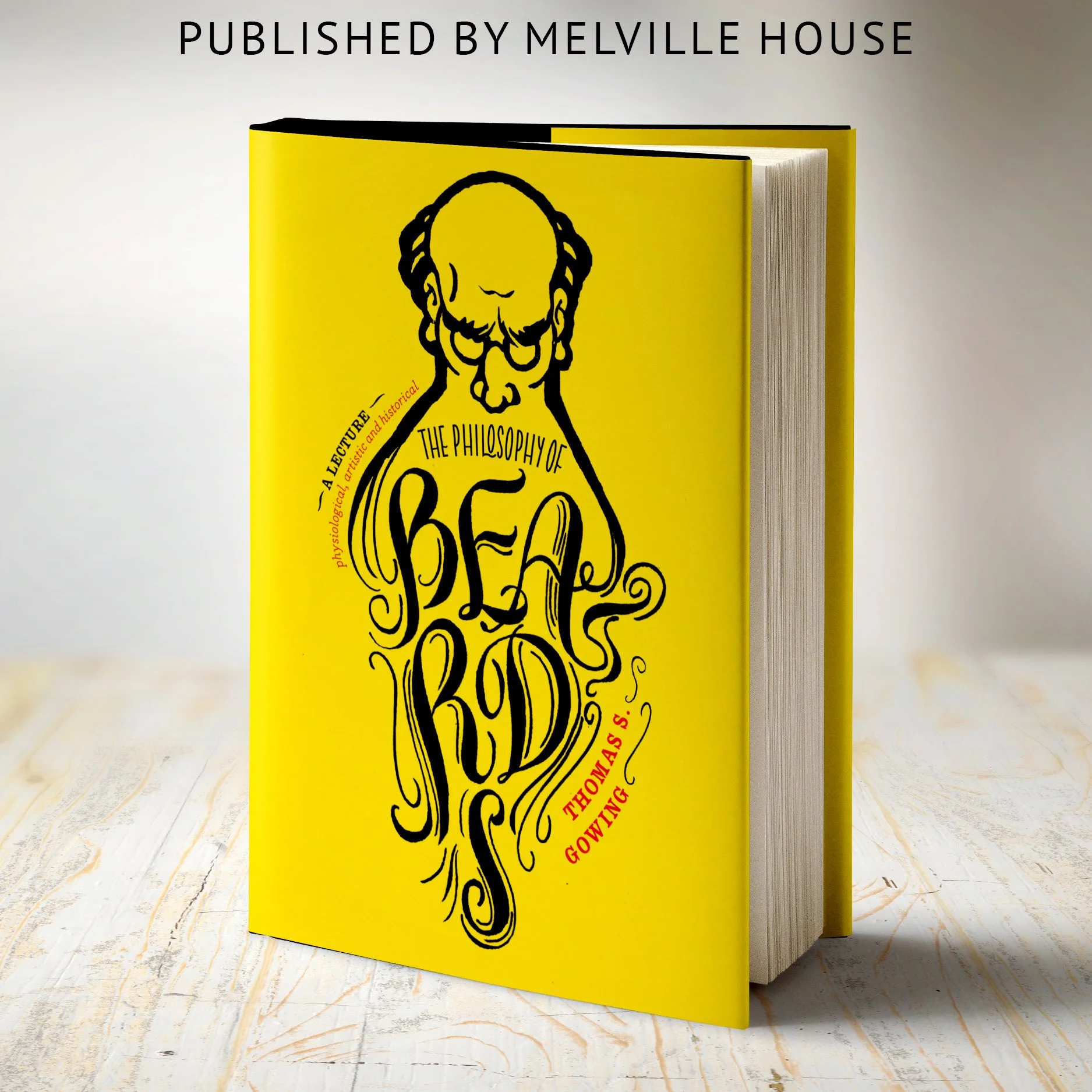
Melville House
The Philosophy of Beard
Lettering refinement for a book cover
Art Director Marina Drukman
Marina Drukman invited me to help refine the lettering for this cover. My role was not simply to redraw the title, but to identify what was weakening the composition and propose a stronger typographic solution.
I began by reviewing the original lettering and pointing out the main issues: inconsistent stroke quality, uneven negative space, weak spacing, and a few letterforms that reduced clarity. Because the title functions as both typography and image here, those details were especially important — the lettering had to feel expressive, but also structurally convincing.
I then reworked the letterforms and spacing to create a more cohesive, legible, and visually taut composition, while keeping the unusual character of the concept intact. The final cover preserved the wit of the original idea and gave it a stronger formal foundation.
The project went on to receive First Place in General Trade Hardcover Nonfiction Cover at the 2019 New York Book Show.
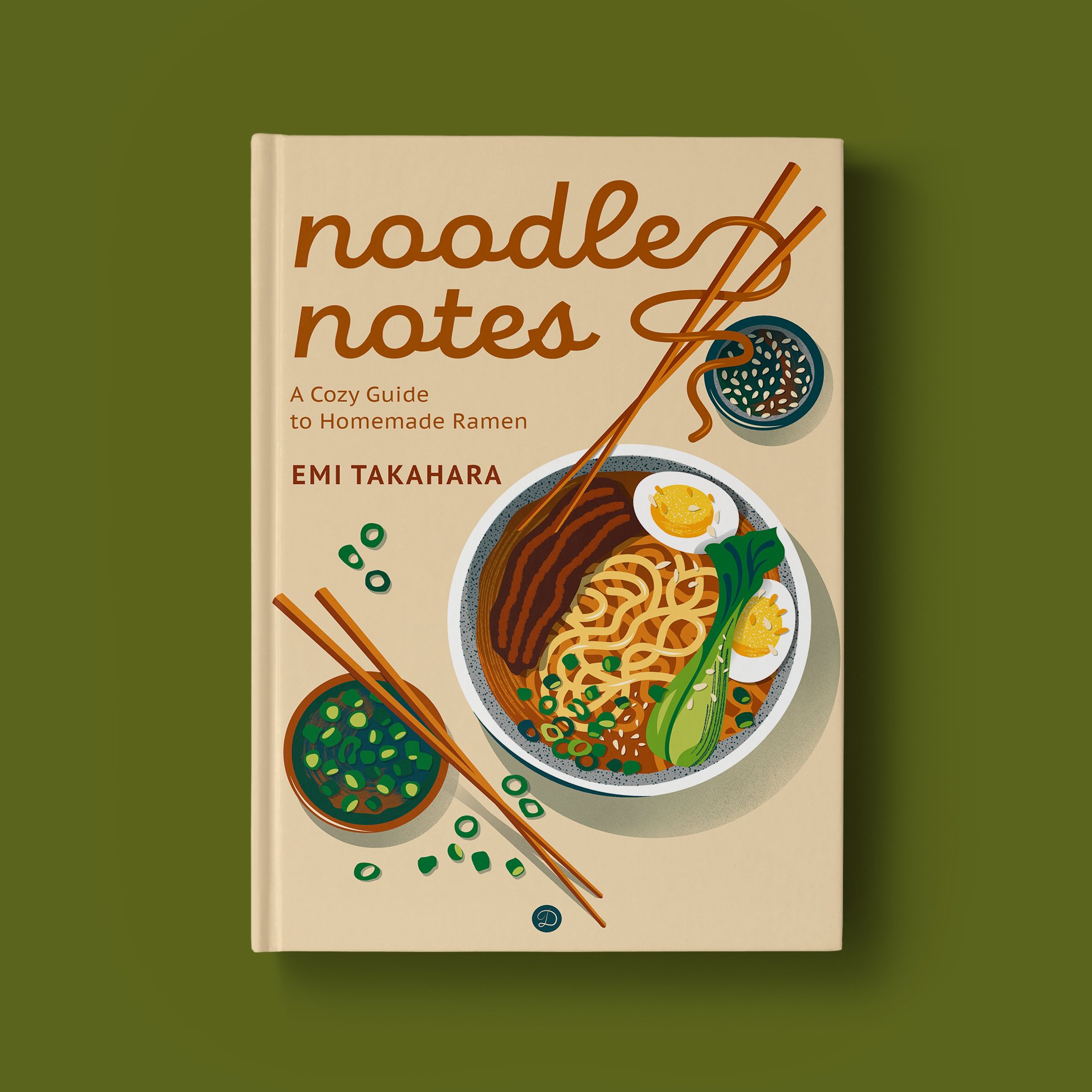
Noodle Notes — Cookbook Cover (Personal Project)
Role: Illustration + integrated cover typography
Noodle Notes is a personal cover concept created to showcase my approach to illustrated cookbook covers: clear at thumbnail size, strong on shelf, and built as a unified system where illustration and typography support each other.
The composition centers on a single, instantly recognizable hero dish, illustrated with clean flat color, simplified forms, and a warm modern palette—appetizing without visual overload. The title lettering is designed to integrate with the chopsticks and noodle strands, creating one cohesive visual language with strong series potential.
Middle-grade book cover, personal project.
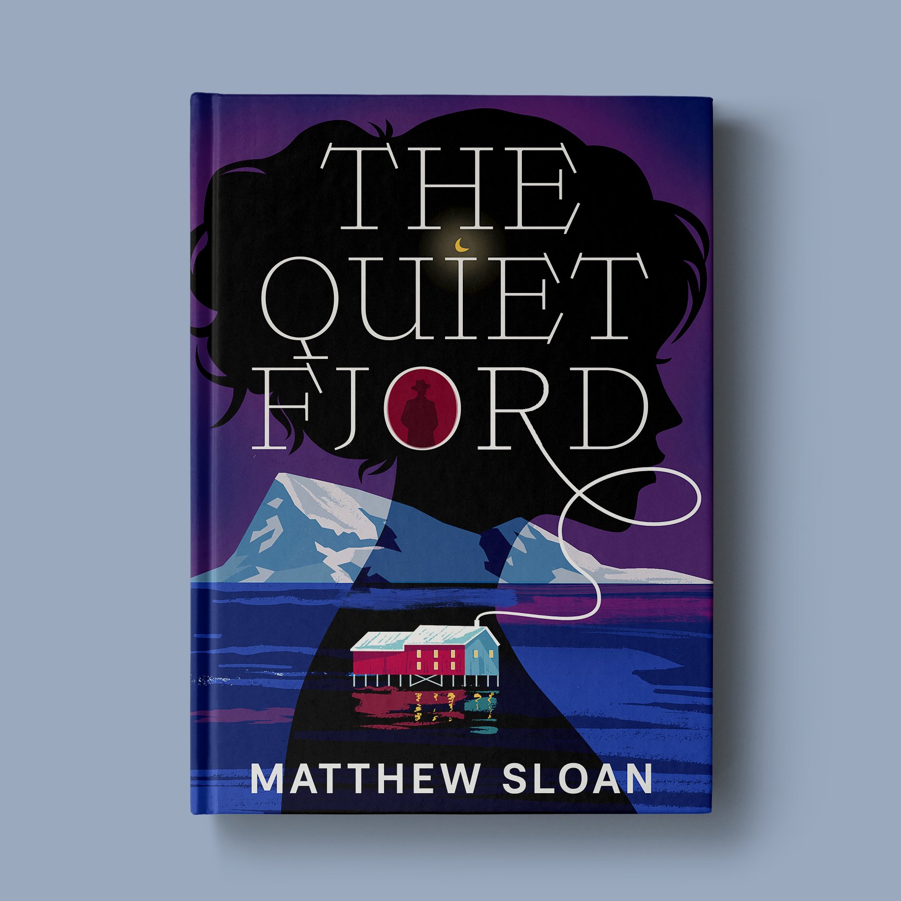
The Quiet Fjord
Literary Psychological Crime — Cover Design Concept
The Quiet Fjord is a personal cover design project created for the US literary crime market. The concept explores psychological tension through atmosphere, restraint, and symbolic storytelling rather than explicit action.
The cover combines illustration and typography into a single visual system, where the landscape functions as an extension of the character’s inner world. A continuous white line subtly connects the title to the house below, establishing the story’s central location without literal explanation.
A restrained color palette and limited red accent introduce tension while maintaining a quiet, literary tone. The design was developed to align with contemporary upmarket psychological crime and literary mystery publishing standards, with a strong focus on clarity, mood, and digital shelf readability.
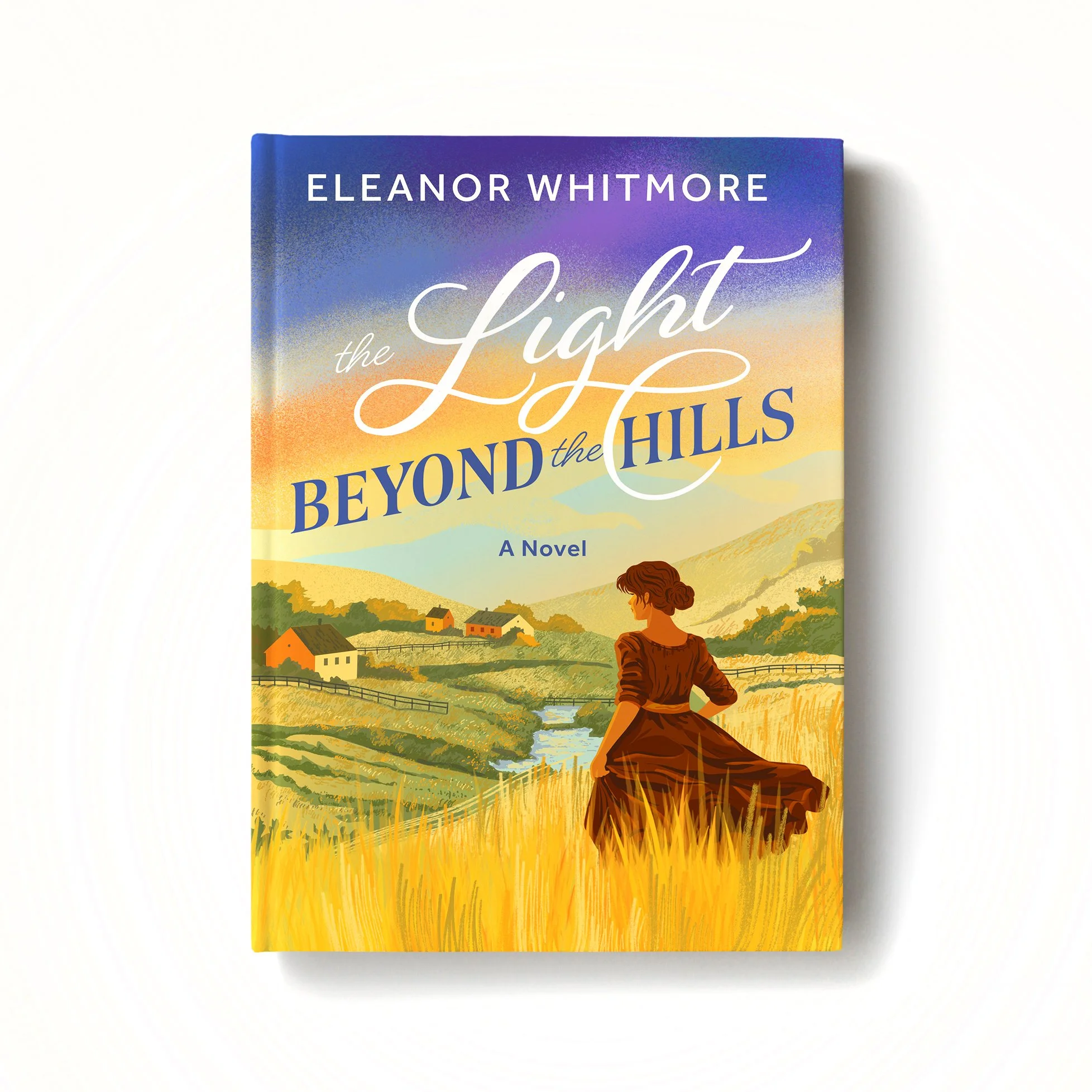
The Light Beyond the Hills — personal cover concept
A personal book cover project created to strengthen my positioning in fiction cover illustration with integrated custom lettering. The mood and visual language fit Inspirational Romance, Women’s Fiction, and pastoral Historical Romance.
I built the cover as a story-first scene with a clear focal figure, layered depth, and a warm-to-cool palette to communicate hope and forward motion. The visual references were inspired by the atmosphere and countryside imagery of Pride & Prejudice.
On my covers, title lettering is always part of the cover system, not an afterthought—designed to work as part of a cohesive language with the illustration.
Personal project, book cover for romcom “Love In The Lab”.
Love on a Deadline
Book Cover Illustration & Lettering
Client: Independent Author Eva Acharya
Art Direction: Dina Ruzha
Author: Eva Acharya
Cover for a charming cross-cultural rom-com set in contemporary Australia, where a disheveled romance novelist and a polished journalist are thrown together by fate and deadlines. The illustration captures the humor and vulnerability of their first meeting — a moment of awkward intimacy that sets the tone for the story.
To reflect the personalities of both characters, I contrasted Shashi’s chaotic, endearing presence with Jun’s poised confidence. I filled the space with subtle narrative cues — scattered pages, an oversized calendar, and a Nepali flag — creating a layered visual story that invites readers into his world.
Typography plays a bold and playful role, echoing the book’s tone and designed to stand out in digital marketplaces. The lettering was custom-drawn to mirror the romantic tension and lighthearted charm that defines the novel.
Inspired by a book I recently read, this personal project allowed me to reimagine its cover illustration, blending my interpretation of the story with my artistic style
Personal project